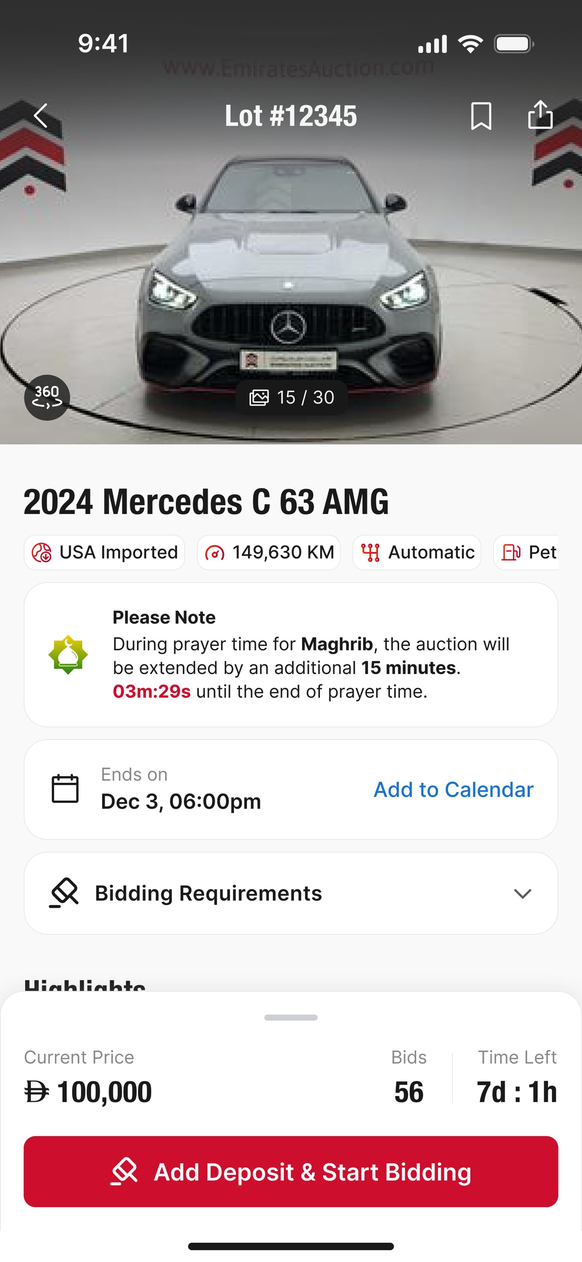
LOT 12345
♡⋯
Nissan Patrol Platinum 2022
99,999 KMCracked
23 bids⏱ 01:23:45
AED215,000
The region's largest auction house. A complete UX/UI revamp covering cars, license plates and premium mobile numbers — across mobile, tablet and web.
It's live — visit the website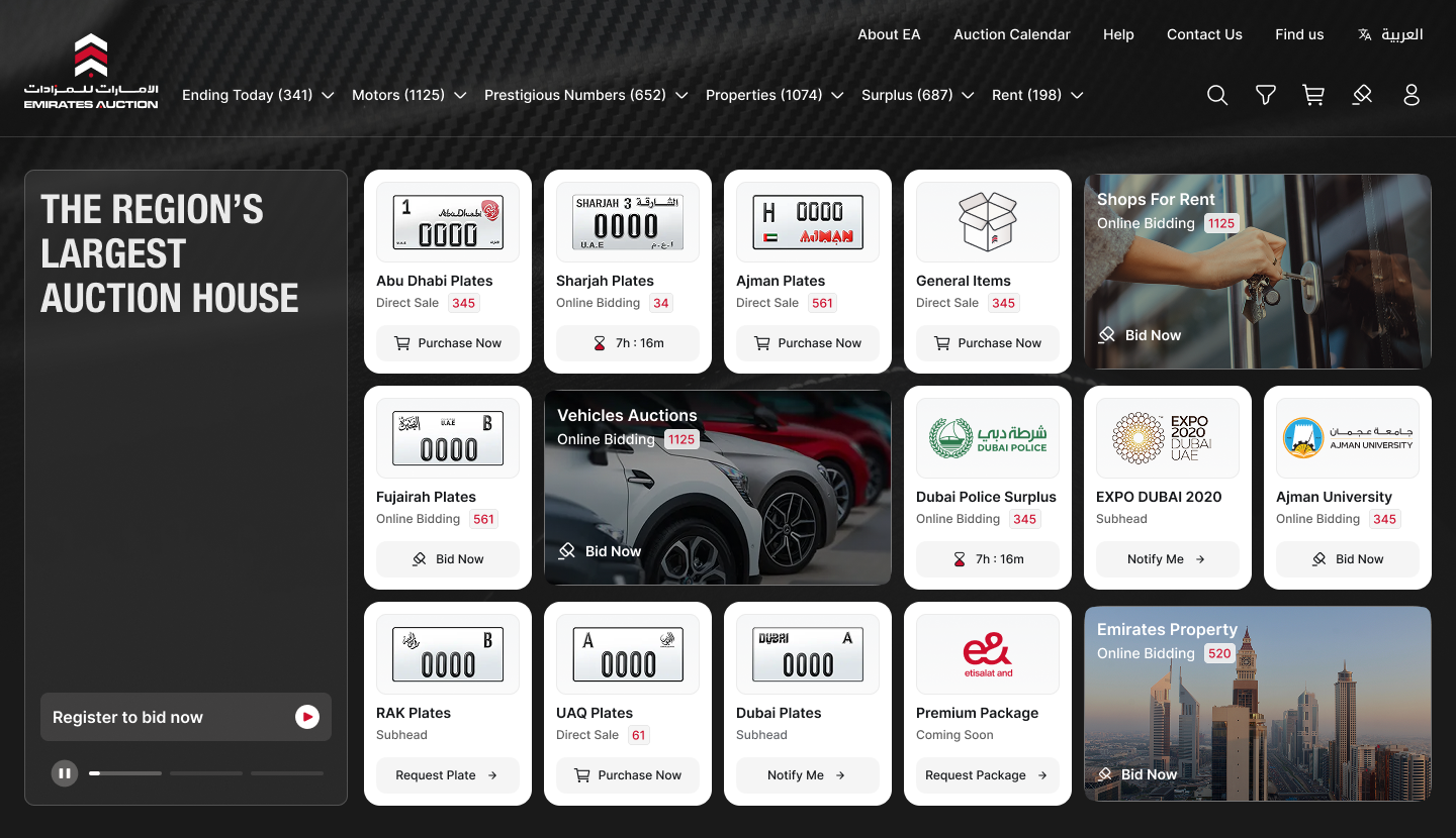
Emirates Auction is one of the UAE's leading online auction platforms for cars, license plates, and premium mobile numbers. The project involved a complete design revamp for the digital experience across mobile, tablet, and web.
The goal was to improve usability, reduce user drop-offs, and deliver a consistent, modern interface across all platforms. As UX UI Lead I was responsible for conducting user research and analytics, identifying usability issues, redesigning flows, creating wireframes and prototypes, testing with real users, and developing a cohesive design system.
On the backend side of the work, I documented UX specs and verified UI consistency during implementation — making sure the new system held together across mobile, tablet, and web.
A two-phase user-centered process. The first diamond explores the problem — research, observation, and synthesis. The second diamond explores the solution — ideation, design, and validation with real users.
A quantitative survey with 8 Emirates Auction users — measurable data on usability, task completion, and satisfaction across the bidding and checkout flows.
Half of users have faced issues understanding how to register or complete a payment. Checkout flow needs an audit.
Only half feel the current design supports easy product comparison and browsing across auction categories.
The results revealed a clear pattern of inconsistencies and usability challenges. Users reported confusion during essential flows like bidding and checkout — validating the need for a more intuitive interface, a consistent cross-platform experience, and streamlined task flows.
Benchmarked three regional auction platforms (anonymized A · B · C) — bidding, checkout, and listings — to define opportunities for Emirates Auction.
Regional general-purpose marketplace. Strong listings + SEO, but dated bidding UI and a scattered checkout.
Niche luxury auctions — premium plates and limited-edition vehicles. Trusted brand, but curated funnel and weak discoverability.
Mobile-first marketplace. Clear bid widget and strong notifications, but onboarding is long and gated.
| Feature | A | B | C |
|---|---|---|---|
| Streamlined bidding flow | ✗ | ✗ | ✓ |
| Clear bid status (leading / outbid) | ✗ | ✗ | ✓ |
| Cross-platform consistency | ✗ | ✗ | ✗ |
| Map view for property auctions | ✗ | ✗ | ✗ |
| Real-time notifications | ✓ | ✗ | ✓ |
| Quick filters for categories | ✓ | ✗ | ✗ |
| Auto-bid with clear leading state | ✗ | ✗ | ✗ |
Major usability friction in almost every module — car listing, bidding process, profile, payments. The platform grew piecemeal and each module felt designed in isolation.
70% of surveyed users have abandoned the platform before completing a purchase or bid. Drop-off concentrated around the deposit-increase and accreditation steps.
90% of users feel the interface is inconsistent across mobile, tablet, and web. Same task, three different patterns — users lost trust by jumping between devices.
of surveyed users found it easy to place a bid on the existing platform. The other 80% needed help, gave up, or felt unsure their bid had even gone through.
User personas were developed from research and feedback to surface real user needs, behaviors and pain points.
Regularly uses Emirates Auction to buy and resell used vehicles. Tech-savvy enough to use online platforms but not deeply involved in complex tools. Clarity and trust are critical for him in any digital service.
Mohammed uses the Emirates Auction mobile app daily. He's familiar with WhatsApp, Instagram, Google Maps and online banking — and expects the same polish from auction tools.
Scenario: Mohammed wants a unique plate number. He expects to find plate "1" in Emirates Auction, pay online easily with his debit card, and receive the plate within 2–3 days. The journey breaks into four phases — each with its own emotional rhythm, friction points, and opportunities.
found bidding "easy" before redesign — the rest experienced friction at one or more journey phases. The pain points map directly to design opportunities below.

A comprehensive token + component foundation, organised as Atomic Design. Atoms compose into Molecules; Molecules into Organisms; Organisms into Templates. Every token traces back to a node in the source Figma file.
A red-and-ink system. Brand red #CE0E2D is the bid-action color — used on the live ticker, the Bid CTA gradient, and the brand mark itself. Ink #1A1A1A is the primary body and the surface for all dark heroes. Eight-step ramps for every semantic family.
Two font families. Inter is the system font for all UI and body — 12 to 80 px on a 110–160% line-height curve. Helvetica Neue Condensed Bold is the brand display face, reserved for page-hero titles and oversized moments. Arabic locale uses Noto Kufi Arabic, sized to match Inter’s x-height.
Used 26× across the Figma library on page-hero titles (“Typography”, “Buttons”, etc.) at 56 / 48 / 40 / 32 / 20 / 16. Uppercase, tight tracking, ~100% line-height. Falls back to Barlow Condensed on systems without Helvetica.
The default font for body, buttons, captions — everything below the hero.
A bilingual double-chevron mark with stacked black-red-black chevrons and a red dot underneath. Always paired with the Arabic + English wordmark, except in chip-sized contexts (favicon, app tile) where the mark stands alone.


Clearspace = height of the brand mark on every side. Minimum print height: 16mm. Minimum digital height: 32px (mark only) / 56px (full lockup).
Stroke-based at 1.75-px on a 24-px grid using currentColor. Inherits its color from the surrounding text — red is reserved for the brand mark, never general icons. Filled variants are used only for active-tab states (selected nav, favourited lot).
A 4-pt / 8-pt rhythm. Component-internal spacing pulls from 4–16; section spacing from 32–96; page-frame side margins are 128 at desktop wide.
From 4 (chips) to 24 (modal). Pill radius (9999) is reserved for buttons and avatar.
A flat-at-rest, lift-on-hover system. Cards never float — they sit on a 1-px hairline border and gain a small shadow only on hover or focus.
A 12-column grid with 24-px gutters and 128-px side margins, centered on a 1280-px max content width.
Hairline rules at 1-px for inline section breaks, 0.7-px for tight tabular divisions. Always use the neutral border tokens — never red.
Native-shell primitives used inside the bidder app on mobile: iOS-style status bar, home-indicator pill, alphabetic keyboard. Sized to native iOS 15+ defaults.
Two primary patterns. The black pill drives non-Bid actions (Continue, Sell with us, View items). The red gradient pill is reserved for placing a bid — the brand's most-clicked, most-watched action.
Filled-at-rest, outlined on focus. The focus ring uses the brand red — never the blue browser default. Validation switches the border to error-red.
The brand's signature unit. Photo or plate render on top, lot meta + countdown + bid button below. Hover lifts the card. The Bid button is always visible — placing a bid takes one click and one confirm.
Slash-separated, Medium 14, neutral. Current page is ink-1; ancestors are fg-2; hover lifts to ink-1 with a 1-px underline.
Status dots, badges, progress bars and step counters. Used to surface activity (bids, notifications), categorical state (live, ended) and progress (multi-step onboarding).
The currency + amount pattern. Small AED prefix in fg-3 always precedes the number, which uses tabular numerals so digits don't shift on every bid.
A two-row top bar — utility strip above, primary nav below. The utility row keeps account, calendar and language switcher always reachable; the primary row drives the seven core auction categories.
A left-rail filter set for search and category pages. Accordion-style groups, range sliders for price/year, multi-select pills, and a sticky "Apply" CTA at the bottom.
Used for FAQ pages, lot-detail spec collapse, and filter groups. Always full-width, 1-px dividers, 200ms ease on open. Title left, chevron right.
A neutralised raster map with brand-red pin markers and lot-card pop-overs. Used on Properties and Find-a-Branch pages. Markers cluster at low zoom and become labelled at high zoom.
The auction screen's anchor. Sticks to the right rail at desktop and the bottom on mobile. Always shows LIVE chip + countdown, current price, next-min bid line, an optional max-bid field, and the big red Place bid CTA.
A 24-px radius card on an ink-56% scrim, centered. Title on top, supporting copy in the middle, primary + secondary CTAs right-aligned at the bottom.
You're about to bid AED 1,275,000 on LOT 12345 · Nissan Patrol Platinum 2022. Once placed, bids cannot be withdrawn.
Emirates Auction is the Middle East's leading auction house since 2004, organising public and online auctions for cars, plates, properties, jewelry and more.
Two full kits assembled from the atoms / molecules / organisms above. Each runs as a click-thru prototype: the public-facing website and the bidder-app workspace.
Marketing site + browse experience. Top nav with mega menus, dark hero with full-bleed photography, live-auctions grid, sticky lot-detail drawer with real-time bid increment.
Open prototype →The live-auction workspace. Lot detail with sticky right-rail bid panel, My Bids table with status chips, Calendar of upcoming sessions, and a fixed bottom live-ticker.
Open prototype →Every token, type and component above maps to a node id in the source Figma library. The full source CSS lives in colors_and_type.css; the brand assets in assets/; the prototypes in ui_kits/. Drop the kit into any new EA surface and stay on-brand by default.
Side-by-side comparison of the redesigned platform. Each pair shows the previous experience next to the rebuilt one — status colors, card layouts and bidding feedback all tied back to the design system, across mobile, tablet and web.
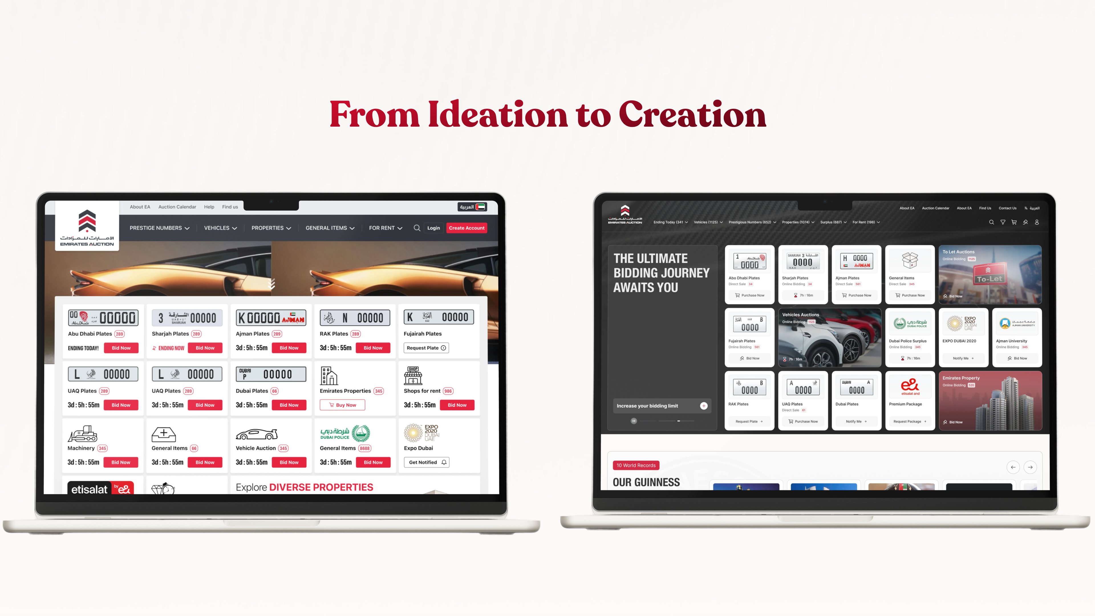
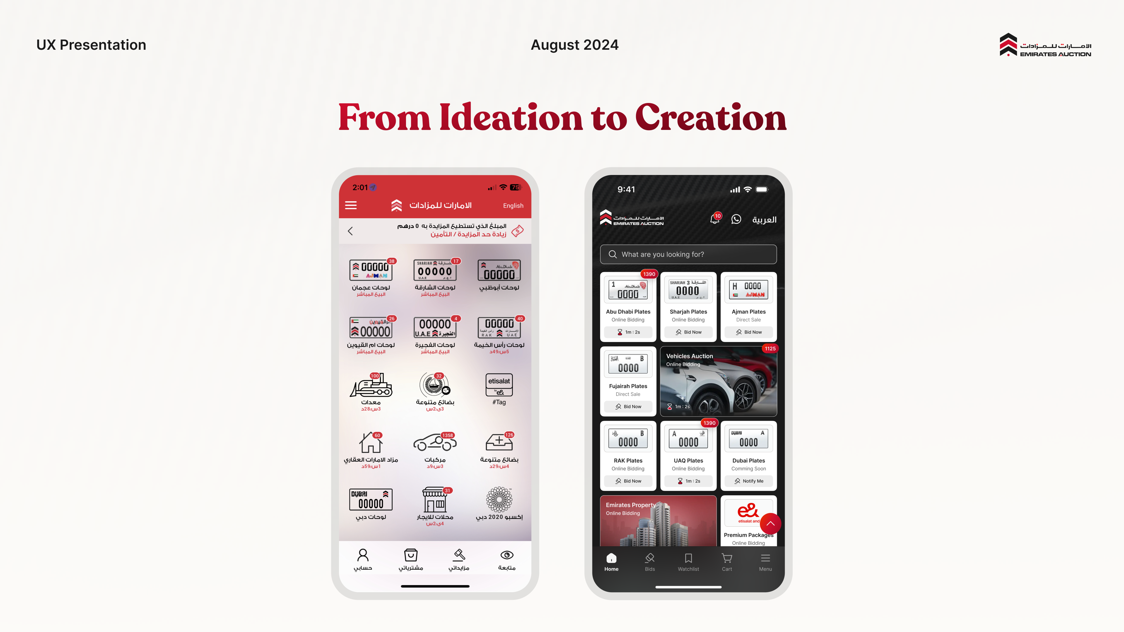
The redesign didn't just solve usability problems — it gave Emirates Auction a foundation for scalable growth across every category and every device.
Through quantitative research, a consistent design system, and a redesigned bidding + checkout flow, the platform now lets users browse, bid, and pay with confidence — on whichever device they happen to be holding.
Arabian Systems · Emirates Auction · 2023 — Present