01 — Principle
Research before pixels.
Every interface starts with the people using it. I spend the first weeks listening — interviews, journey mapping, jobs-to-be-done — before opening Figma.
A small archive of products and platforms I've designed end-to-end — from research and architecture to interaction, motion, and shipped pixels.
The region's largest online auction platform — cars, license plates, premium mobile numbers. Complete UX/UI revamp across mobile, tablet, and web. +20% checkout completion, +10% deposit rate via digital.
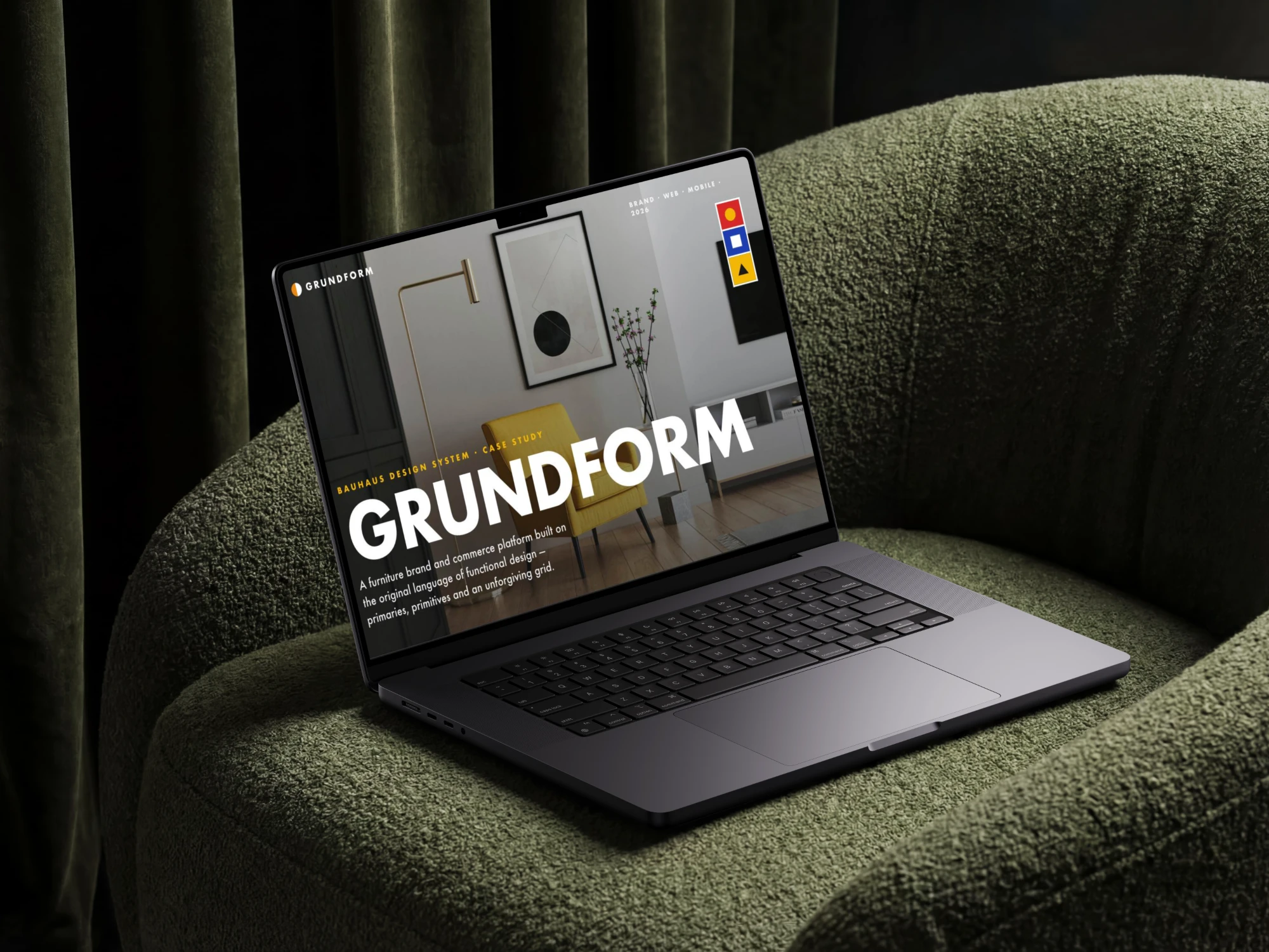
View case studyA Bauhaus-inspired design system exploration — geometric primitives, primary palette, strict grid. Form-follows-function applied to a modern product surface.
View case studyA women's atelier dressed in the International Typographic Style — strict 12-column grid, Inter flush-left, B&W editorial photography, exactly one signal red. Identity, storefront, lookbook and mobile app.
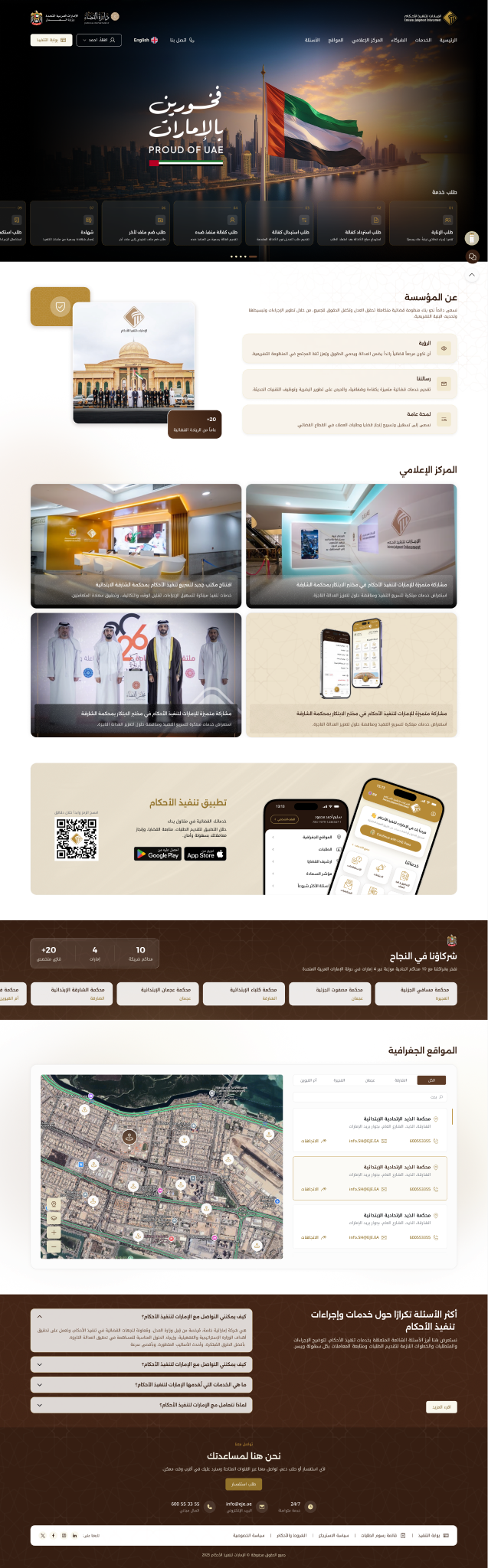
View case studyA UAE legal-tech redesign — bilingual IA, a gold + black system rooted in national identity, and a connected mobile flow that cuts time-to-answer. Live at eje.ae.
View case studyAn enterprise analytics dashboard rebuilt for density, clarity, and faster decisions. Confidential client work, available on request.
View case study


Approach
Not just deliverables — a way of working that respects research, structure, and the slow craft of refinement. Here's what tends to set the outcome apart.
Every interface starts with the people using it. I spend the first weeks listening — interviews, journey mapping, jobs-to-be-done — before opening Figma.
Information architecture is the spine. I treat hierarchy, grids, and tokens as load-bearing — the rest of the design rests on them gracefully.
Restraint is a feature. Whitespace, micro-typography, and intentional motion create products that whisper instead of shout — and users trust them more.
I build for the third year, not just the launch. Components, contracts, and contributor docs survive growing teams and shifting product needs.
Animation is information. Every easing curve and duration reflects cause-and-effect — never decoration. The interface feels physically credible.
I work close to engineers — same Slack channel, same review cadence, same vocabulary. Designs are written with implementation in mind from the first frame.