
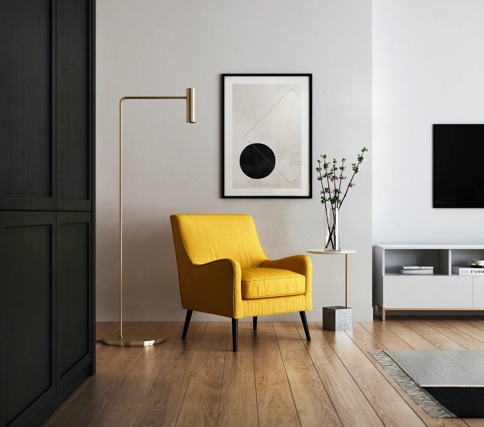
GRUNDFORM
Brand · Web · Mobile · 2026
Bauhaus Design System · Case Study
GRUNDFORM
A furniture brand and commerce platform built on the original language of functional design — primaries, primitives and an unforgiving grid.
01 · The Brief
A furniture brand,
reduced to essentials.
GRUNDFORM makes geometric, function-first furniture. They needed an identity as honest as the objects — so we built it on the original language of functional design.
 GRUNDFORM · Catalogue 2026
02 · The Style
Why Bauhaus fits a furniturebrand.
The Bauhaus didn't just theorise modern design — it built the furniture. Breuer's tubular-steel chairs, Brandt's lamps, the Wassily — all came out of its workshops between 1919 and 1933.
Its rules are GRUNDFORM's rules: form follows function, ornament removed, every shape earning its place. A brand selling reduction should speak in a reduced language — true primaries, hard geometry, and an unforgiving grid.
The shared brief
Function before decoration
Honest materials & structure
Made for industry, at scale
03 · Principles
Four rules, carried into every pixel.
Form follows function
Nothing decorative. Every element does a job — or it's removed.
Geometry as language
Circle = movement, square = grounding, triangle = direction. Shapes carry meaning.
Primaries + black on neutral
Red, blue, yellow and ink. No pastels, no gradients, no more than three hues.
Flat & structural
Zero radius, no shadow, 3px ink rules. The grid is the ornament.
04 · Overview
GRUNDFORM makes geometric, function-first furniture — and needed an identity as honest as the objects.
We rebuilt the brand, storefront and mobile app on a single Bauhaus design system: true red-blue-yellow, hard geometry and 3px ink rules, with zero rounded corners by design.
One component kit now drives every surface — from the marketing site to checkout to the operations dashboard — so a three-person team ships consistently and fast.
05 · Use Cases
What people do with it.
As a shopper
I want to browse and buy in a few taps so I can furnish my home without the friction of a clunky store.
As an interior designer
I want to filter by material and dimension so I can specify the right pieces for a client, fast.
As the studio team
I want to manage orders and stock in one place so the shop runs without spreadsheets.
06 · Project Details
The engagement.
07 · Feature List
What we shipped.
01
Marketing storefront
Editorial landing and collection pages that sell the objects, not the chrome.
02
Filterable catalogue
Filter by material, price and colour; switch grid or list with no reload.
03
Cart & checkout
A three-step path to pay — saved addresses and every major payment method.
04
Mobile app
A native iOS and Android app sharing the exact same component kit.
05
Operations dashboard
Live orders, stock and revenue for the team, on the muted palette.
06
Design system
Colour, type, icons and 30+ components from a single source of truth.
The Foundation
The Design
System.
Everything below is one system. Colour, type, icons and components — the primitives every screen is assembled from. Build once, ship everywhere.
08 · Foundations
Colour
Classic primary · brand & marketing
Red
#D62828
Blue
#1D3EB0
Yellow
#F2B705
Ink
#1A1A1A
Muted · product surfaces
Brick
#BE3320
Navy
#232F3B
Ochre
#EC8B13
Forest
#233B2A
09 · Foundations
Typography — Jost
Aa
ABCDEFGHIJKLM · abcdefghijklm · 0123456789
24365480
A geometric grotesque — the closest free relative of Futura, the Bauhaus's own typeface. Circular bowls, even strokes, set bold, uppercase and tracked so type behaves like another primitive.
Display
Jost Bold · -2% tracking
Label / eyebrow
Jost 600 · UPPERCASE · +18%
Body
Jost 400/500 · 1.5 line
10 · Foundations
Icons
11 · The Kit
Components
ButtonsPrimary, secondary, sizes
Shop now →DetailsAdd to cartOutline
InputsText field & search
you@grundform.comSearch the catalogue…
SelectionCheckbox, radio, toggle
Badges & tagsStatus & removable
NewSaleIn stockOak✕
DropdownSelect menu
Sort by
Newest
Price — low to high
Price — high to low
TabsSegmented control
OverviewSpecsReviews
BreadcrumbWayfinding
HomeSeatingTubular Chair
PaginationPaged lists
‹1234›
AlertsInline feedback
Free delivery over £200. Card declined — try again.
StepsCheckout progress
123
AvatarsPeople & teams
MKJSAB+4
SliderPrice range
12 · The Kit
Cards
New
Seating
Tubular Chair
£420
Journal
On reduction
Why we removed the radius, the shadow and the gradient — and kept the grid.
+34%
Add-to-cart after relaunch
£284k
Revenue · last quarter
13 · The Kit
Menus & navigation
14 · Foundations
Grid system
Web · 12 columns
72px margin · 24px gutter
Mobile · 4 columns
20px margin · 16px gutter
15 · Wireframes
Before colour,
the bones.
Every screen sketched in mono — boxes, hatch and rule — to settle hierarchy before the kit is bolted on. No primaries, no type weight decisions, no surface treatment: only what goes where, and at what density.
5 flows · 2 px line · 0 colour
01 · Landing
02 · Listing
03 · Product
04 · Cart
05 · Checkout
16 · Final Screens — Web
High-fidelity, end to end.
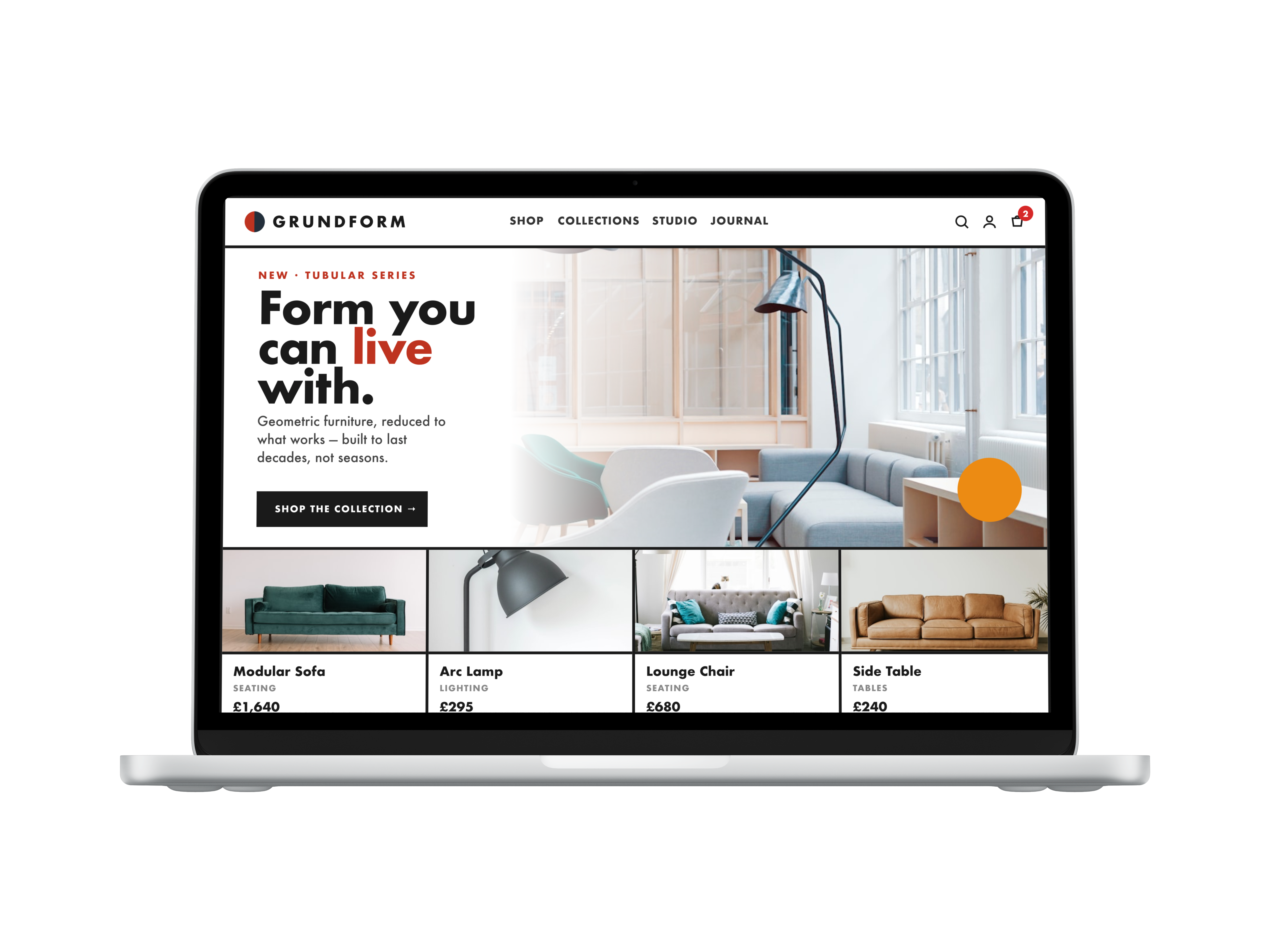
Five core screens — landing through checkout — every one assembled from the same kit, down to the breadcrumb.
01Landinggrundform.com
02Product ListingFilter · sort · grid & list
GRUNDFORM
2
HomeShopSeating
Category
Seating
Tables
Lighting
Storage
Price
£0 — £900
Material
Tubular steel
Oak
Leather
Colour
24 results in Seating
Sort: Newest
New
Tubular Chair
Tubular steel
£420

Lounge Chair
Leather
£680

Modular Sofa
Wool
£1,640
Sale
Bench Seat
Oak
£360

Reading Chair
Tubular steel
£520

Stool 01
Oak
£140
‹123›
03Product DetailGallery · specs · add to cart
GRUNDFORM
2
HomeShopSeatingTubular Chair


Seating · Tubular steel
Tubular Chair
£420
A cantilever chair in chromed tubular steel and woven seat. One continuous frame, no visible joints — function expressed as form.
MaterialChromed steel · wool
Dimensions58 × 70 × 82 cm
ColourwaysRed · Blue · Ink
Lead time2–3 weeks
−1+
Add to cart — £420OverviewSpecsDelivery
04CartLine items · summary
GRUNDFORM
2
HomeCart
Tubular Chair
Seating · Red
−1+
Remove£420

Arc Lamp
Lighting · Ink
−1+
Remove£295
Order summary
Subtotal£715
DeliveryFree
VAT (20%)£143
Apply
Total£858
Checkout →
05CheckoutAddress · delivery · payment
GRUNDFORM
✓ Cart→✓ Information→3 Payment
CartInformationPayment
Contact
Shipping address
Studio · Default
Bauhausstraße 1, Weimar
Home
Gropiusweg 9, Dessau
Studio storage
Industriestraße 22, Dessau
Delivery
Standard · FreeExpress · £18
Payment method
Card
PayPal
Apple Pay
Google Pay
VISA
AMEX

Tubular Chair
Qty 1 · Red

Arc Lamp
Qty 1 · Ink
Subtotal£715
DeliveryFree
VAT£143
Total£858
Secured · 3-D Secure
17 · Final Screens — Mobile
The same kit,
thumb-first.
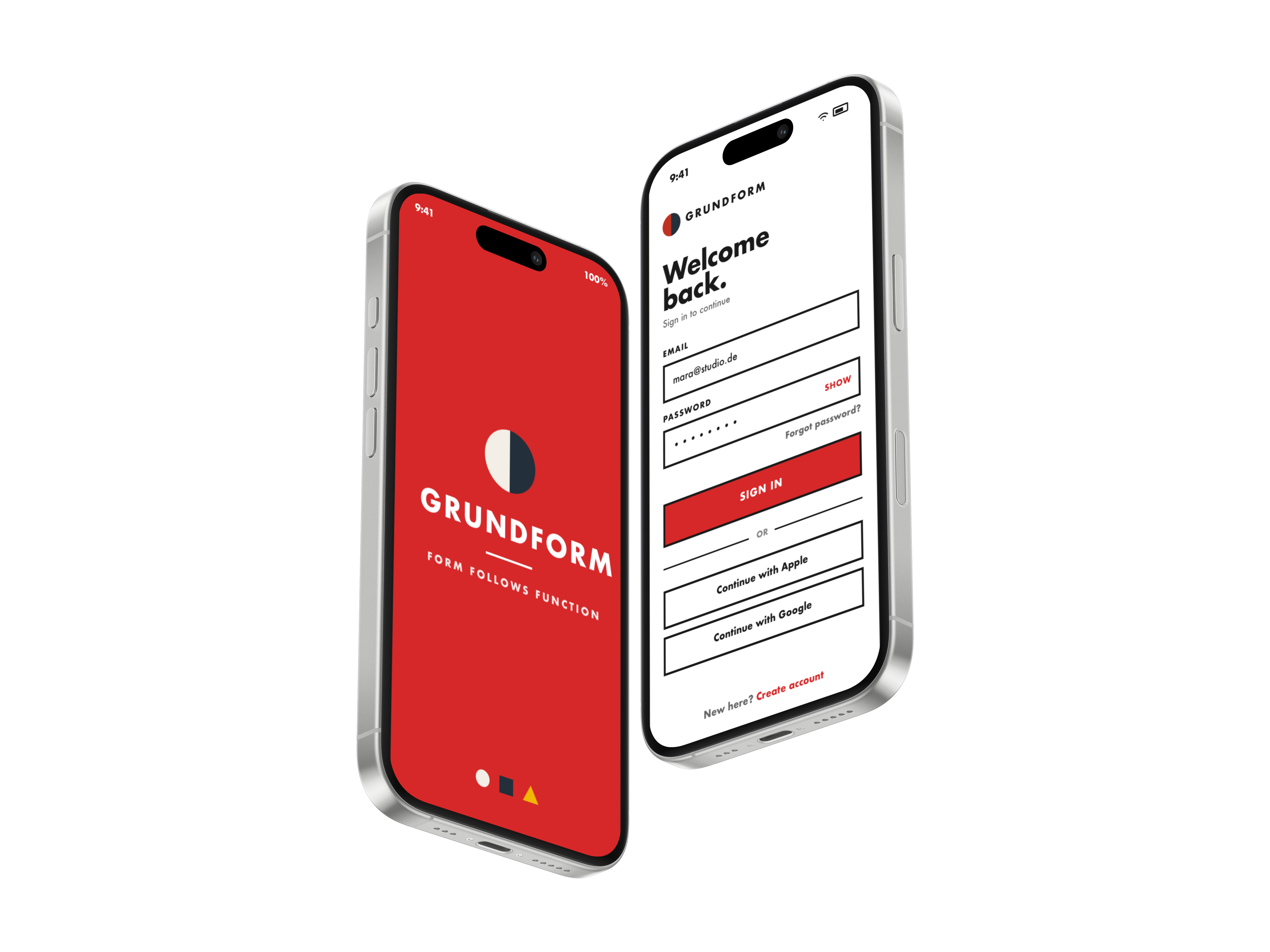
01
Splash
App launch
02
Welcome back
Sign in
Core flow · Home → Listing → Product → Bag
GRUNDFORM
2
Search furniture…

FeaturedSee all

Modular Sofa
£1,640
Arc Lamp
£295
New inSee all
Lounge Chair
£680
Side Table
£240
Home
Seating
Tubular Chair
£420+
Lounge Chair
£680+
Modular Sofa
£1,640+
Side Table
£240+
Listing

Seating · Steel
Tubular Chair
£420
Cantilever frame in chromed steel with a woven seat. One continuous line — no visible joints.
Colour
−1+
Add to cart
Product
Your cart2 items
Tubular Chair
Red
−1+
Arc Lamp
Ink
−1+
Subtotal£715
DeliveryFree
Total£858
Checkout · £858
Cart
Bauhaus DS × GRUNDFORM
Thank you
A small studio in Berlin, three rules from a century ago, and the quiet satisfaction of nothing left over. Thank you for spending time inside it.
GRUNDFORM — Modern ObjectsCase Study · June 2026